Showing posts with label Color. Show all posts

Wednesday, February 22, 2017

Americhem U Back in Session


Last week, Americhem U kicked off its Winter/Spring season with a class on “Designing Color Masterbatches,” taught by Americhem color and synthetic fibers expert Roger Threadgill. It was nice to see Americhem U back in session in Dalton, Georgia, where we’ve been teaching color classes to industry professionals since 2011. During that time, we’ve taught 23 classes to almost 700 industry professionals focusing on topics such as color trends, color measurement, color tolerancing, weathering and polymeric additives.

This year, our classes are being held at a new location, the Dalton Golf and Country Club. Participants enjoyed the nearly hour-long presentation before networking with other professionals in the carpet and synthetic turf industries during a buffet lunch. We have found that this “lunch and learn” format helps educate while keeping up with the developments within the industry.

We learn much through our interactions with those who attend Americhem U classes. In fact, we survey participants at every class, and the subsequent year of classes is determined by those that we survey. We teach the classes quarterly in Dalton, semi-annually in Cuyahoga Falls, Ohio (near Cleveland) and, for customers of Americhem, we’ll even bring Americhem U to you at your plant or office. We’ve also instituted a series of Americhem U webinars that can be attended anywhere there’s a good internet connection.

Color is a complicated subject and it has a huge impact in the manufacturing arena. We pride ourselves on helping you to understand color’s many facets and how you can get color to help you sell your products, no matter what industry you’re in.

For more information, visit www.americhem.com/americhemu or contact me by posting a comment below.
 
Scott Blanchard
Corporate Marketing & Communications Manager

Thursday, August 4, 2016

Monthly Color Inspirations - Heather


As summer begins to blend into fall, we take time to reflect on our August color inspiration: Heather.


Heather is a blend of neutral creams and greys with soft pinks and purples. Reminiscent of classic mauve, Heather is perfect for the transition of seasons.

Bright, but delicate, Heather compliments traditional neutrals, sharp black and white, and bold tones like burgundy. Much like August is a bridge between hot summer days and cool fall afternoons, Heather is a bridge between classic and contemporary colors.  With more depth than lilacs and pale pinks, Heather provides an intensity without intimidation.

Looking to get expand you color knowledge? Register for an Americhem U session today!                                                                                                                                            


Wednesday, July 6, 2016

Monthly Color Inspiration - Boisterous


July brings a flurry of summer activity and Boisterous is a wonderful representation of that!

The perfect inspiration for bright summer days and warm celebrations, Boisterous is in our family of yellows and was originally introduced at Americhem’s 2016-2017 Color Trends presentation as part of the “Welcome Distraction” palette.

Yellow is the best color to create enthusiasm for life and can awaken greater confidence with optimism. It’s the color of happiness, enlightenment and creativity. The sentiment behind yellow is based on where it is found in nature, in the natural world yellow is the color of sunflowers and daffodils. A neon, lemon hue, Boisterous is a rambunctious and rowdy tone compared to some tamer yellows.  Ready for anything, it’s about letting off steam and enjoying life.

Being the lightest hue of the spectrum, yellow is uplifting and illuminating. A simple color that offers hope, cheerfulness and fun. Boisterous takes those characteristics to a new height with its bright tone.

Looking to get professional insight into color? Register for an Americhem U session today!

Monday, June 27, 2016

Monthly Color Inspiration - Cool Mint

As we leave the month of June, we can take time to reflect on this month’s color inspiration: Cool Mint.

Cool Mint is in our family of greens and is perfect as we transition to the hottest days of the year.

Generally, green shades can be taken to represent life itself and the essence of every living thing on earth. It can be jealously or envy, but it also denotes growth and renewal. Green is frequently associated with springtime and the re-birth that happens to our earth every year. As summer begins, we can fully appreciate the scope of this rebirth in our own communities. Cool Mint is fresh and healthy, and can represent a new beginning. When combined with a wide variety of other colors, green can take on a life of its own.

Plant a seed in peoples’ mind that will surely grow with the power of green. Let Americhem help put Cool Mint to work for you.

Thursday, January 7, 2016

Monthly Color Inspirations - Turquoise

The color turquoise controls emotional balance and gives a sense of stability. Turquoise is a great color to have around you, as it helps with clear thinking and decision-making.

The color turquoise will make you feel happy and relaxed because it combines the light blue of the sky with the invigorating green of the seas. With that combination of blue and a small amount of yellow, turquoise fits on the color scale between green and blue.

Global Meaning of Turquoise*
  • In western cultures, the turquoise gemstone is the symbol of friendship and brings peace to the home and good fortune to the owner.
  • Native Americans associate the color of turquoise with the blue sky and the green earth. It is seen by many as being symbolic our roots in nature.
  • Tiffany Blue has grown to represent the luxury jewelry store, Tiffany & Co. The color has even been trademarked.
We can help you convey clarity, harmony and creativity to your customers with the perfect shade of turquoise. Contact us today.

 *http://www.empower-yourself-with-color-psychology.com/color-Turquoise.html


Thursday, December 3, 2015

Monthly Color Inspirations - White

The color white represents purity, innocence, wholeness and completion. In color psychology, white is the color of new beginnings, a blank canvas waiting to be written upon. White promotes a feeling of fresh beginnings, renewal, and clearing obstacles.

There are very few negative meanings of white, but too much white can be cold, isolating and empty. As opposed to black in the US, other cultures use white to signify death and mourning. In these cultures, death usually means the end of one life and the beginning of another, moving forward to a new life.

We can help you convey cleanliness and simplicity with the perfect shade of white. Contact us today.

Monday, November 30, 2015

Color Tolerancing: When the Human Eye Isn’t Enough

As sensitive to color as the human eye can be, it simply cannot define color differences quantitatively for precise and repeatable analysis. In some cases, visual perception of color variance could mean shipping a batch of product that does not meet specification, and in other cases, it could mean discarding a batch of good materials. These costly mistakes can be avoided when tolerances are established and differences are quantified.

How can you tell if the color is right?


There are a number of ways to determine whether a batch falls within an acceptable tolerance; however, not all methods will provide precise results. At Americhem, we suggest that the best and most accurate way to test acceptable color tolerance is to use an elliptical pass/fail system, which is based upon an equation developed by the Colour Measurement Committee. This system places a customizable emphasis on hue and chromaticity value, allowing you to determine how much weight is placed on the hue and chromaticity differences of the two colors.

Having good tolerances in place for each product allows you to make quick and easy pass/fail or ship/don’t ship decisions that can directly impact the profitability of your business. At Americhem, we understand how challenging it can be to accurately define color tolerances. You can read an article in Plastics Engineering about Measuring Color from Americhem Color Expert, Ron Beck.

For more information on color tolerancing or to learn about Americhem’s services, visit americhem.com or contact Scott Blanchard at sblanchard@americhem.com.

Monday, November 9, 2015

Monthly Color Inspirations - Brown

The color brown is serious and down to earth with properties like stability, structure and support. The warmth of the color relates to the protection and support of the family unit with a sense of duty and responsibility.

The color brown symbolizes quality in everything - a comfortable home, the best food and drink. The warmth of woodgrain home accents relaxes you with and creates a sense of security. Brown provides a feeling of good health, brings you down to earth and adds order to your life.

Global Meaning of Brown*
  • With its connection to the outdoors and down-to-earth activities, brown is suitable for businesses promoting outdoor products and services.
Unique Meaning of Brown in Different Cultures*
  • In Chinese horoscopes, brown is the color for earth.
We can help you convey endurance, duty and stability to your customers with the perfect shade of brown. Contact us today.
*http://www.empower-yourself-with-color-psychology.com/color-brown.html

Thursday, October 8, 2015

Color Trends 2016- 2017

Color is our business. We work every day to ensure that our customers get the color they need for their products. But we don’t just match your color, we design your color to look great with the utmost in product performance.

To help our customers keep up with the latest product design trends, we just introduced the 2016-2017 Americhem Color Trends forecast in Dalton, Georgia. I presented our color trends to a record number of attendees in hopes of providing them with aesthetic inspiration. It was great to have so many creative minds in one room. As lead color trends specialist, I get the privilege to live and breathe colors all year round. The team and I conduct a lot of research and collaborate to bring the color trends to life. We are confident that these colors will guide consumer preference in the years to come. Our program can be valuable in keeping industry professionals ahead of the curve when it comes to color choices.

I took the audience through colors and palette themes by exploring images representing real life architecture, fashion, high tech gadgets, interior design and more. We find that these images are essential in demonstrating our trends in everyday settings.

This year, the trends are comprised of six color palettes including:

  • Rush Hour- The beginning and ending of every work day and work week.
  • Office Diligence- Hues from this palette are observed in everyday work. 
  • Casual Friday- TGIF everyone! A day to wind down and relax at the end of the week, but also to provide inspiration for a Friday night out or a weekend getaway.
  • Night Life- Night Life is glamorous and sophisticated, with contrasting colors that are used to accentuate luminous effects. Sparkles, glitter, shiny fabrics, and textures abound.
  • Welcome Distraction- This palette is a mix and match of bright and medium shades, perhaps eccentric, but also playful and energetic.
  • Sunday Brunch- The pastel hues of this palette remind us of traditional brunch foods and beverages, and impart a feeling of calm.

Our audience was so receptive to the presentation and I was pleased to see the feedback they provided.

Mary K. said, “Great inclusion of various cultural influences - fashion, pop culture, technology.” We were also told by Cherise P., “I enjoyed the way the presentation was given as a story that we could relate to. The visual presentation was well put together.” I enjoyed talking to all of the designers about the colors and it was a great experience for me as a presenter to see people get inspired.

Color trends apply to all industries interested in accenting their products with innovative, modern colors. Our forecasts reach across any and all product categories. From carpet to automotive and apparel to packaged goods, consumers are looking for the latest colors to make them stand out from the crowd. Please reference our color trends inspiration sheets to see how you can introduce our colors in any setting. 

And now, for the first time, you can experience our color trends in an upcoming webinar November 5. Register Today. If you are interested in learning more you can contact me at abarto@americhem.com.

Aubrey Barto
Color Trends Specialist, Americhem

Monday, October 5, 2015

Color of the Month - Orange


The color orange evokes thoughts of fall. Of changing leaves, sunsets and desert sandscapes. It’s active. It’s wholesome. 

Orange is vibrant. It symbolizes energy, vitality, adventure, warmth, and good health. Darker oranges offer a sense of comfort while lighter oranges are soothing.

But orange has a bit less intensity than red, calmed by the cheerfulness of yellow. "Orange is red brought nearer to humanity by yellow." Wassily Kandinsky, Russian painter and art theorist.

Global Meanings of Orange*
  • Orange is associated with vitamin C and good health.
  • Orange is symbolic of autumn.
  • Orange is the color of life rafts, hazard cones, and universally associated with safety.

That’s why the orange family of colors from Americhem offer so many opportunities to differentiate your products. Let us know how we can help you design your next orange today.
*www.colormatters.com

Friday, September 25, 2015

Colors That Rock: The Top 10 Rock Bands with Color in Their Name - Part II

Welcome back as we continue our countdown of the top 10 rock bands with color in their name. Last time, we looked at number 10 through number 6, and in this edition, we now count down the top 5.
  
A punk rock group formed in 1986, these rockers were inducted into the Rock and Roll Hall of Fame in 2015 in their first year of eligibility. They’ve sold more than 75 million albums around the world. The California band’s two founders, Billie Joe Armstrong and Mike Dirnt, played in a band called Sweet Children from the time they were 14-year-olds and by 1986 they recorded their first EP. To avoid confusion with another similarly named group, they changed their name to Green Day, allegedly because of their partiality to marijuana. They’ve released 11 albums over the years, 7 of which are certified platinum.

The only ensemble in our list to use an umlaut in their name was formed in 1967 in New York under the name Soft White Underbelly. After some other temporary names, they settled on BÖC in 1971. It was derived from a poem by their manager, Sandy Pearlman, who referred to the Blue Oyster Cult as a group of aliens who had assembled to secretly guide Earth's history. The origin of the umlaut is debated, but it set a precedent that was followed by Motörhead, Mötley Crüe and Queensrÿche among others. The heavy metal act has produced 13 studio albums and is known for their hits “Don’t Fear the Reaper,” “Godzilla” and “Burning for You.” And, you guessed it, they remain a touring act to this day.


The English hard rock group has twice been nominated for the Rock Hall, but has not achieved the distinction to date. As a predecessor of modern heavy metal music, they formed in 1968 and were at the height of their powers during the 1970s. Hailed for their concert volume, they made the Guiness Book of World Records as “the globe’s loudest band.” Fueled by hits like “Smoke on the Water,” “Hush,” Highway Star,” and “Woman from Tokyo,” Deep Purple took a hiatus from 1976-1984 but endure, touring in 2015 and, presumably, beyond.

As another heavy metal pioneer, Black Sabbath has enjoyed an immensely successful career, culminating in their 2006 induction into the Rock Hall. Along with Led Zeppelin and Deep Purple, they are credited as being one of the “unholy” trinity of heavy metal music in the 1970s. They’ve toured widely with a variety of different lineups, triggered at least in part by lead singer Ozzie Osbourne’s battles with drugs and alcohol. The band’s name, so often associated with the occult, came about as a result of the band playing a show across the street from a movie theater that was showing the horror film Black Sabbath starring Boris Karloff. The band is ranked number 85 on Rolling Stone’s list of the 100 Greatest Artists of All Time.

1.       Pink Floyd
This seminal group of architecture students in London began their career under names such as Sigma 6 and The Tea Set. They played at universities and clubs and attracted a strong underground following. The group’s initial lead singer and frontman, Syd Barrett, came up with their eventual name and it has less to do with color than you might think.  The name was a hybrid of two American bluesmen, Pink Anderson and Floyd Council. The history of the band can be broken into three eras: one with the enigmatic Barrett as the lead, one with composer and bassist Roger Waters in command, and at the end of the band’s career when they were led by sublime guitarist David Gilmour. Inducted into the Rock Hall in 1996, this band’s gargantuan, laser-tinged, psychedelic stadium shows became the standard by which all other concerts will be judged. Last playing together for three songs at the Live 8 concert in 2005, a true reunion is not possible with the deaths of Barrett (2006) and Richard Wright (2008). Nonetheless, they released an album,The Endless River, consisting of mostly instrumental songs in 2014, culled from recordings made during the band’s last album, The Division Bell, in 1994.


So there you have it, for better or for worse. Do you have other color-named bands you think deserve recognition? Do you disagree with the order in which we’ve ranked them? Leave us a comment to continue the conversation.


Scott Blanchard
Corporate Marketing & Communications Manager

Monday, September 21, 2015

Colors That Rock: The Top 10 Rock Bands with Color in Their Name - Part I

As a manufacturer of color used in plastics and synthetic fibers, Americhem helps add brand and identity to a variety of products across many industries. So often, color is the item that consumers most identify with a product, service, logo or brand identity.

Rock and Roll Hall of Fame in Cleveland, Ohio.
In a similar way, some of the greatest bands in rock ‘n’ roll history have chosen names that prominently feature color. In all of these cases, it doesn’t matter if the color is featured in their instruments, their album covers, their outfits or the videos showing on their gigantic screens. Color is forever a part of their identity.

It is with this in mind that we rank the top 10 rock bands with color in their name. You may notice a bias towards classic rockers, due mainly to your blogger’s advanced age. Several of these bands have brought their colorful identity all the way to the Rock and Roll Hall of Fame. We’ll count them down from number 10 to number 6 in this post, followed by number 5 through number 1 in a post later this week. So let’s take a look.

This country/rock outfit emerged from the psychedelic era of 1969 San Francisco and performed with many like-minded bands in that scene. In fact, several members of the Grateful Dead performed with the band during their infancy, including Jerry Garcia, who contributed the distinctive pedal steel guitar sound so closely associated with folk and country rock. The band tours to this day despite the deaths of NRPS stalwarts John “Marmaduke” Dawson, Spencer Dryden and Allen Kemp.

As the only female act on our list, the Indigo Girls rose to fame in the late ‘80s. Amy Ray and Emily Sailers, having met each other in elementary school in Georgia, first started performing together in high school. After the pair returned to Georgia homesick from their experiences at two different out of state colleges, they were looking through a dictionary trying to find a cool name and “indigo” was a word that struck them. They toured extensively and released 14 studio albums, including 2015’s “One Lost Day.” Known as much for their activism as their music, the Indigo Girls have toured with several versions of their own backing band as well as their familiar work as a duo.

A local entry (we’re headquartered near Akron, Ohio), this garage rock band led by Dan Auerbach and Patrick Carney was formed in 2001, when they self-produced their records by recording in basements and garages, hence their classifaction as a “garage band.” Heavily influenced by the blues, they began having their albums professionally produced in 2008. Touring widely to support their act, they have relied on touring musicians to back their blues-rock sound. The group’s biggest success was its 2010 album Brothers from which they won three Grammys.

These Dutch rockers still perform today, having been founded in 1961. Lead vocalist and guitar
player George Kooymens and keyboardist/bassist Rinus Gerritsen remain with the band since the beginning, while Barry Hay and Cesar Zuiderwijk joined in 1967 and 1970 respectively. Most known for their monster 1973 hit “Radar Love,” Golden Earring also charted in 1982 with “Twilight Zone.” By far one of the most popular Dutch acts ever, they’ve notched 30 top 10 singles on the Dutch charts during their 54 years in the business.

The first appearance on our list of a Rock and Roll Hall of Fame band, the Chili Peppers were
inducted in 2012. Originally formed in 1983 in Fairfax High School in Los Angeles, their funk rock stylings were also influenced by punk and alternative rock. Funk icon George Clinton even produced their second album. The band faced a serious crisis in 1988 when founding member Hillel Slovak died from a drug addiction, causing bandmate Jack Irons to quit the band. The group forged on with a new lineup, which evolved through the years and they continue performing (do you notice a theme here) as an active band today, even appearing during the Super Bowl XLVIII (2014) halftime performance. They’ve won 6 Grammy Awards and have received countless nominations for various music industry awards.


Be sure to log back onto our blog soon when we’ll count down from number 5 all the way to number 1.

Scott Blanchard
Corporate Marketing & Communications Manager

Wednesday, September 2, 2015

Color of the Month: Yellow

Being the lightest hue of the spectrum, yellow is uplifting and illuminating. A simple color that offers hope, cheerfulness and fun.

Yellow is the best color to create enthusiasm for life and can awaken greater confidence with optimism. It’s the color of happiness, enlightenment and creativity. The sentiment behind yellow is based on where it is found in nature, in the natural world yellow is the color of sunflowers and daffodils.
Global Meanings of Yellow*
  • In almost every culture yellow represents sunshine, happiness, and warmth.
  • The human eye processes yellow first. This explains why it is used for cautionary signs and emergency rescue vehicles. 

Unique Meanings of Yellow in Different Cultures*
  • In Japan, yellow often represents courage.**
  • The ancient Mayans associated the color yellow with the direction South.

Brighten the lives of your customers, let Americhem create your yellow today. 


*http://www.empower-yourself-with-color-psychology.com/color-yellow.html
**www.colormatters.com

Monday, August 10, 2015

What’s the Difference Between Organic and Inorganic Pigments?

Raw material science plays a big part in the quality of our products and our reputation in the industry. Since color is one of our core competencies, pigments are a very important material category. At a recent Americhem U color class, we were asked to define the differences between organic and inorganic pigments. Both play an important part in the world of colorants and both become an integral part of our color concentrates.


Organic pigments are based on carbon rings or carbon chains. Inorganic pigments are not based on carbon and could consist of metal oxides or other naturally occurring ingredients. From a standpoint of molecular structure, that is the primary difference, although organic pigments can contain inorganic elements that help stabilize the properties of the organic, carbon-based component. Chemically, you can see the carbon in the structure diagram below, representing Pigment Red 202. 

C = Carbon
Cl = Chlorine
O = Oxygen
N = Nitrogen


Inorganic pigments without carbon rings or chains look like this example - titanium dioxide. 

O = Oxygen
Ti = Titanium

Aside from the molecular structure, there are some generalizations that can be made about organic and inorganic pigments:

Inorganic
  •          Larger particle size
  •          Generally more opaque, with better ability to hide a substrate or base color
  •          Lower chroma, or brightness
  •          Generally more stable, for example, to light or chemicals
  •          Can be derived from minerals or metals
  •          Take less energy to fully develop, or disperse, the color


Organic
  •          Smaller particle size
  •          More transparent or translucent
  •          Higher chroma
  •          Generally less stable, particularly to sunlight and heat
  •          One class of organics are dyes
  •          Could be derived from plants and plant products
  •          Take more energy to disperse


Examples of inorganic pigments include titanium dioxide white or iron oxide red.  Examples of organic pigments include Phthalocyanine blue or green and Quinacridone red or violet. Despite the long, alphabet-spanning names, the common thread is that carbon is present in their molecular structure.

Consider us your authority when it comes to color. If there are other aspects of color that you’d like for us to explore, join the conversation and leave us a comment. 

Tuesday, August 4, 2015

Color of the Month - Red


Red stimulates and is full of emotion. It can mean power or danger, passionate love or raging anger. It is the hottest of all the warm colors.

Red demands attention, no matter what sensation it represents. You can use it to make people take notice, and it conveys a sense of action. It is one of the most visible colors, second only to yellow.

Global Meanings of Red*

  • Red is second to blue as the favorite color of all people.
  • Red is the most popular color used on flags in the world. Approximately 77% of all flags include red.
  • Red is the international color for stop.

Unique Meanings of Red in Different Cultures*

  • Red is the color of good luck in Asia and is the most popular color in China.
  • Red is an auspicious color for marriage. Brides in India and Nepal wear red saris; in Japan, a red kimono symbolizes happiness and good luck.
Let us help you harness the power of red today, with all its subtleties, heat, and sophistication.

*www.colormatters.com

Wednesday, July 1, 2015

Color of the Month - Blue

Blue is calming. It can be strong and steadfast or light and friendly. Blue has more complex and contradictory meanings than any other color. Almost everyone likes some shade of the color blue.

Blue comes from nature; from the blue in the sky and earth’s waters. It’s calming and cool and seems to make time pass more quickly. Blue is also important and demands respect. It’s intelligent, steady, and traditional.

Blue, in all of its shades and tones, ranks so high as a favorite color that it can achieve many desirable outcomes for your products.

Global Meanings of Blue*
  • Blue is the #1 favorite color of all people.
  • 53% of the flags in the world contain blue.
  • Blue jeans are worn all over the world.
  • Aristocracy is blue-blooded in all European languages.

Unique Meanings of Blue in Different Cultures*
  • Greeks believe that blue wards off "the evil eye.”
  • “Prince Charming” is called “The Blue Prince” in Italy and Spain.
Let Americhem help you create a blue that speaks to customers, with all of its nuances.

*www.colormatters.com

Friday, April 17, 2015

Domotex Asia/ China Floor 2015

The 17th edition of Domotex Asia/ China Floor was held March 24-26 at the Shanghai New International Exhibition Center. With more than 1,275 companies in attendance representing all flooring industries from decking to carpets and turf, this is the largest floor materials show in Asia. The Americhem team joined the more than 30,000 visitors from over 100 countries to learn about the newest trends and technological advances of the flooring industry. Our commercial team enjoyed networking and seeing what the big names in flooring had to display.

Belgian carpet company Beaulieu International Group will invest 13.5M dollars on two plants in Weihai City. They have already began the process of moving their equipment from Belgium to these new China plants. This is just one of many examples that show manufacturing being moved here to China where raw materials and many customers are located.
Shanhua Carpet, which is also located in Weihai City introduced their new line of Tylon products which is an innovative biological based fiber for carpets. These products are made of a new generation of their already eco-friendly fiber Sorona, which is a flexible, renewable fiber used in the carpet industry.

Shanhua also introduced its GY1323 series of carpets that are marine themed. These carpets are made with textures of polygonal cells with shimmering sea and oval patterns like shells on the beach. Paired with a pleasant ocean wall decor, it conveys features of environmental protection and comfort. You can see the trends changing in the industry away from the muted stock colors to more vibrant colors and patterns. There is much less beige living room carpet or self-promoting corporate designs.

The hottest products this year had to be the PE Wood Plastic Composite (WPC) co-extruded products. Sentai, Helong and New Techwood are major players in this market and are bringing the innovation to the forefront of industries such as decking. Right now, their business is going out to Europe, USA and Canada.

There was an educational seminar this year about WPC to introduce its innovation and usefulness to the flooring market. We also learned that Trex plans to enter the China market and will soon introduce their own line of PE WPC co-extruded products.

Domotex Asia/China Floor is always a great event and we are grateful that we were able to attend to see not only our customers, but to see how the industry as a whole is growing.

Contributors:
Frank Li, Commercial Manager, Americhem SUZ
Bruce Zhang, Technical Sales Manager, Americhem Suzhou
Rose Tu, Commercial Manager, Americhem SUZ

Friday, February 27, 2015

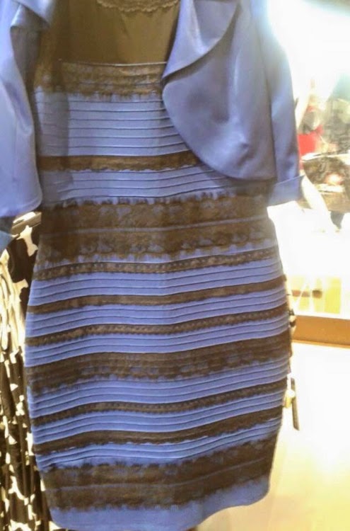
What Color is that Dress?

The internet is bustling over a photo that is causing lots of controversy.

What color is this dress?
Photo from Tumblr user swiked

This photo was posted to Tumblr with a simple question: What color is this dress? Who would have thought it would become an internet sensation. 

There are two main responses: White with Gold or Blue with Black.

The true colors of the dress are blue and black. You can see the same dress below.


By using Photoshop, you can see what happens to the photo when you limit the light coming in from the background. The dress is starting to look like the professional photo. Light is an important aspect to how we see color. Our brains are good at correcting for the effects of lights. 
Photo from wired.com

The reason "the dress" looks white and gold in some pictures and it looks blue and black in other pictures is because colorants in the dress can behave differently under different lighting conditions. If a colorant appears to be the same color under different lighting conditions, then it has color consistency. We interpret the color of objects based on how we interpret the light around objects.

This is why when you match a tie to a shirt in the store and then you wear it outside it may mismatch. This phenomenon is called metamerism and the only way to prevent this from happening is to spectrally match the color. The color may not be color constant, but it will match in various illuminations.


Tell us what you see? White and Gold or Blue and Black?


Ron Beck
R&D Manager – Core Technologies, Americhem Inc.

Monday, February 2, 2015

Colors with Meaning

At Americhem, color is our business. We work with color every day and we know what makes a good color. With our high color standards, we take a lot of care when choosing the colors to represent our company. We used a tool known as the Dewey Color System®, which is considered the world’s first statistically valid color test that utilizes extensive opinion testing to scientifically verify the common links between color and emotion. With this system, we were able to accurately choose company colors to convey our company values.

Navy Blue
Navy Blue expresses a sense of authority, stability, and efficiency. Over the past 73 years, Americhem has been established as an industry authority. We work hard to educate through our Americhem U  series of courses, to host presentations at industry trade shows, and to be an available resource for our customers.

Navy signifies a company that is stable and efficient and is depended on by its customers. Trust and acceptance from our customers are important. We consistently follow our company principles, holding ourselves to maintaining the highest of ethical and moral standards with our customers.

Sage Green
Sage Green indicates nature and wholesomeness. It represents Americhem’s dedication to being eco-friendly and preserving the natural environment. We recently attained ISO 14001 certification for our Cuyahoga Falls, Ohio plant. This distinction recognizes Americhem for environmental management solution dyeing process  that saves water and energy while eliminating waste material.
systems. We are also the leader of the eco-friendly solution dyeing process that saves water and energy while eliminating waste material.


Green generates a calming, relaxed mood and shows that a company is genuine, forthright, and sincere. Our ability to surpass the competition is dependent upon the collective drive and intellect of cohesive teams. We work in partnership with our customers to create the best available solutions.

Burnt Orange
Burnt Orange is the color chosen to accent our two main colors. While not part of our logo, burnt orange still plays an important part in our company image. It represents Americhem’s specialty in uncovering solutions to problems. Americhem is dedicated to being your problem solver. Some of Americhem’s best selling products came into being as a result of our responsiveness to a specific customer problem.  From idea to reality, we collaborate with our customers to overcome product design challenges and to meet exacting color and end use property specifications.

Orange embodies our innovative spirit and responsiveness to customer needs. Our research and development team are constantly working on polymeric research that leads to groundbreaking technologies  for our customers. We strive to improve our own efficiency and effectiveness to provide the best value and innovations to our customers.

Aubrey Barto
Marketing Assistant, Americhem Inc.

Wednesday, November 19, 2014

Material Breakthroughs Lead to Best Performing Turf

The history of synthetic turf dates back to the 1960’s when Monsanto developed what later became known as Astroturf for the Astrodome in Houston, Texas, home of major league baseball's Houston Astros. The advent of domed, indoor stadiums and their inability to support a natural turf playing field soon caused the use of synthetic turf to spread throughout the major leagues and other professional and collegiate athletics. Back then, the turf fields were made from Nylon 6,6, and the filament was unforgiving and rough to players, causing frictional burns from falling and sliding on the surface.

This early turf soon gave way to the second generation of synthetic fields in the 1970s. This time, the material of choice was polypropylene (PP) and it was European companies that brought it to market in 1976. This shift saw the industry going to a longer, tufted filament plus the addition of sand infills, making the material more forgiving to the players.

In the 1990’s and through the present day, most turf fields around the world are made with linear low density polyethylene (LLDPE). The use of this material was a breakthrough, and for more reasons than one. The LLDPE material was much softer and it “gave” better. It also featured greater traction than the previous generations of turf, which was supplemented by the inclusion of infills made of sand and recycled rubber. Most stadiums and fields in the world today use this third generation turf system. (Source)

The move to LLDPE fields was driven by safety of the players. These were not the “rugburn” inducing fields of previous generations, and players groups from all over professional sports supported these third generation fields. Instead of fighting against artificial surfaces, many of today’s players prefer synthetic turf for safety, aesthetics and duration of play on one field.

But what came along with the switch to LLDPE fields was quite surprising, and further supports the use of the material. When subjected to weathering testing, the LLDPE fields were able to hold their color longer - much longer - than the previous two materials (Nylon 6,6 and PP).

FIFA, the international governing body of soccer, recommends 3,000 hours of accelerated weathering testing on turf in a QUV device to determine color hold. At Americhem, we’ve found the LLDPE fields can sustain 6,000, 9,000 and even up to 12,000 hours of xenon arc weathering testing and still retain their desired colors. Certain colors are better than others (reds are notoriously less colorfast, for example) and not all colors can hold up to the 12,000 hours of testing, but Americhem’s weathering studies go far beyond what FIFA recommends because we want to be able to make sound recommendations to our customers.

Americhem has released a synthetic turf color selector guide which contains cardwrapped samples of various colors of turf yarn, including greens and a number of popular logo colors. All of the colors recommended in the book can stand up to at least twice the FIFA mandated accelerated tests of 3,000 hours. It’s also in these longer tests that you can see the difference in failure mechanism between the LLDPE and the previous materials. So the material was developed to make life better for the players and, in the end, it also proved to be the superior material from a standpoint of longevity and reduced color fade.

Americhem has written a white paper on the subject of today’s turf fields and weathering. Please contact Scott Blanchard at sblanchard@americhem.com to receive a copy of the white paper or to receive a copy of our turf color selector guide.

Larry Campbell
Americhem’s resident synthetic turf expert